Design Style
- Professional
- Unique
- Innovative
- High-End
What we finished
- Brand Strategy
- Logo Design
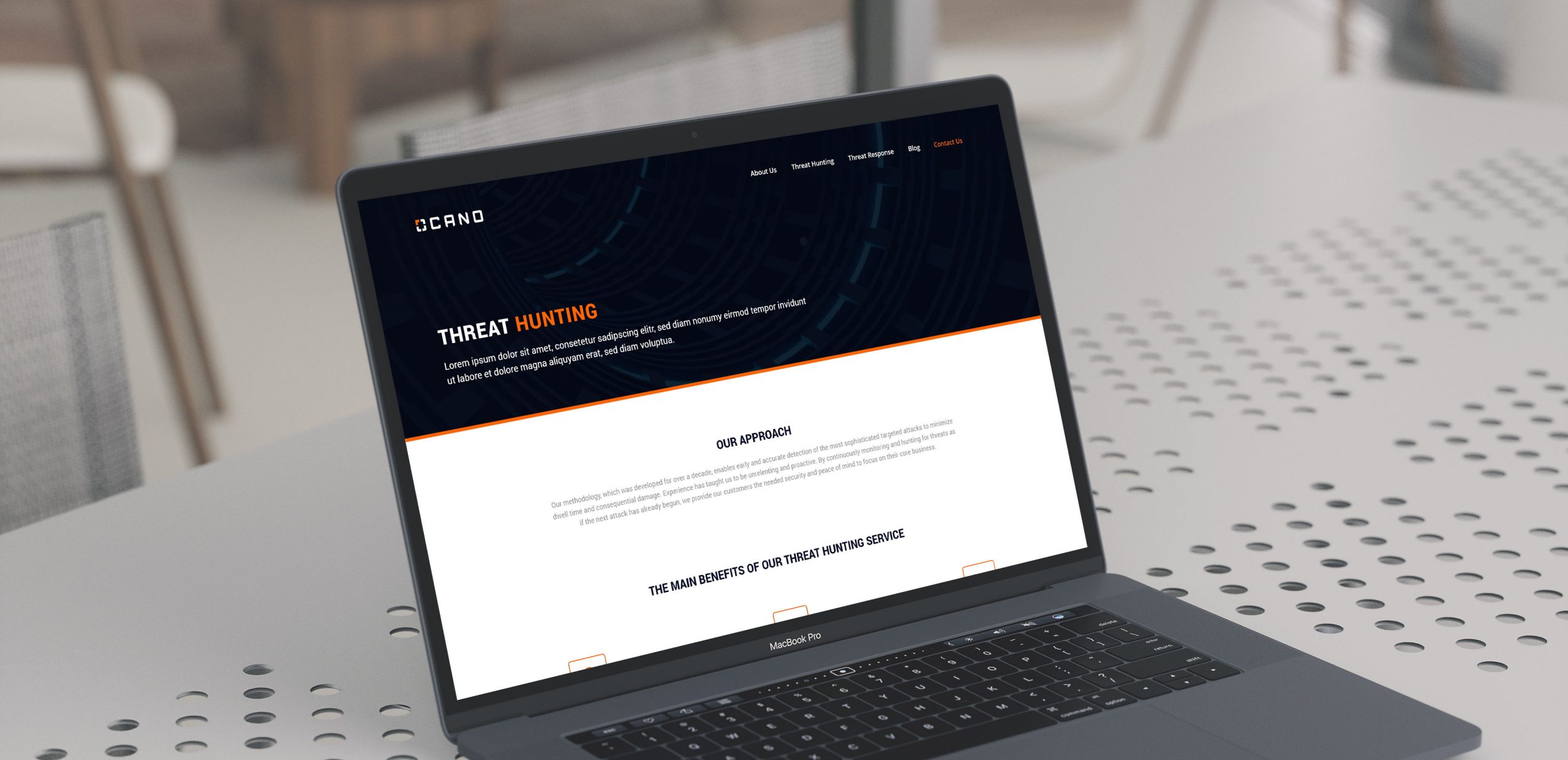
- Web Design
Ocano provides advanced cyber security and consultation services to protect enterprises against sophisticated cyber threat actors.
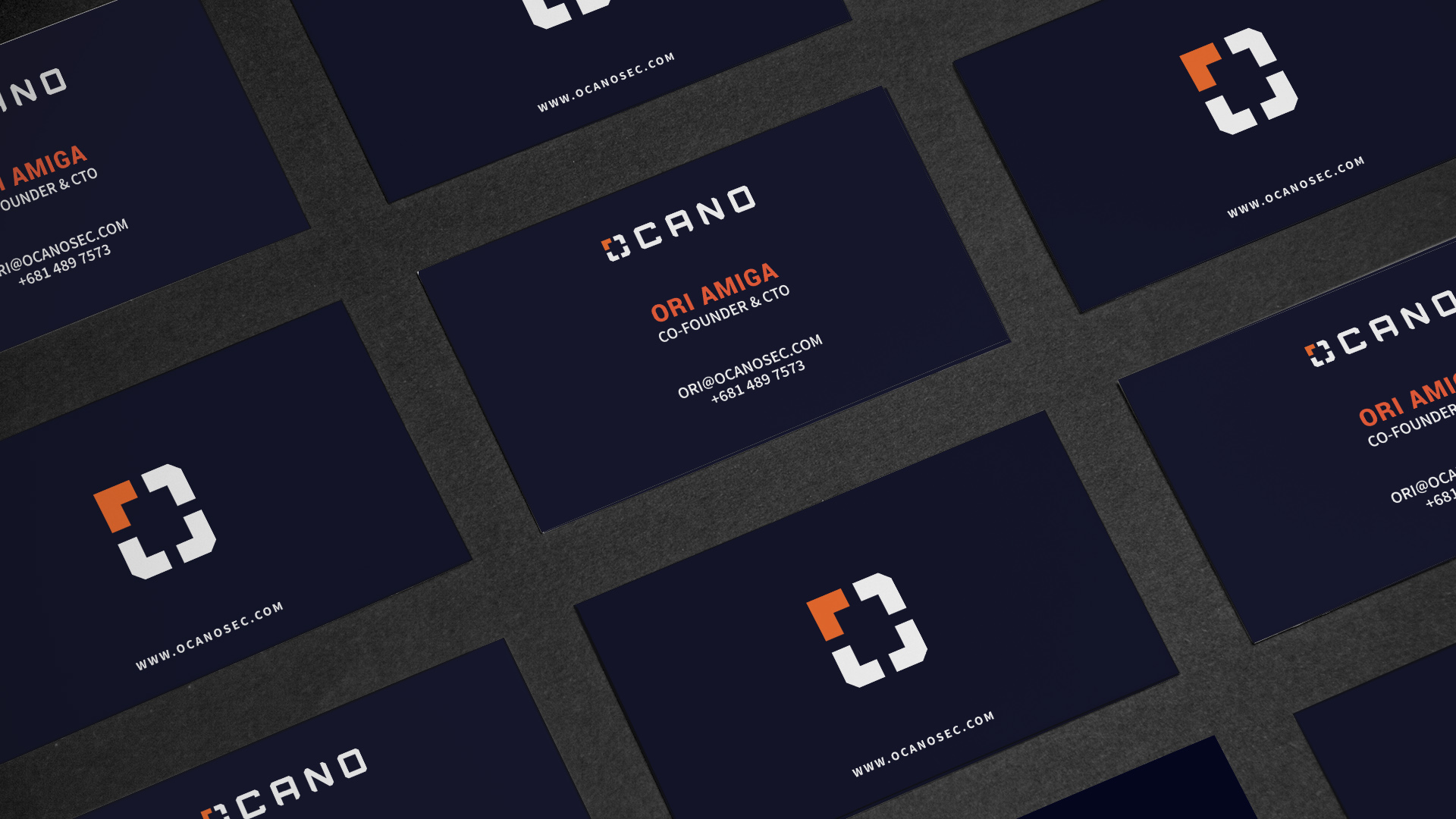
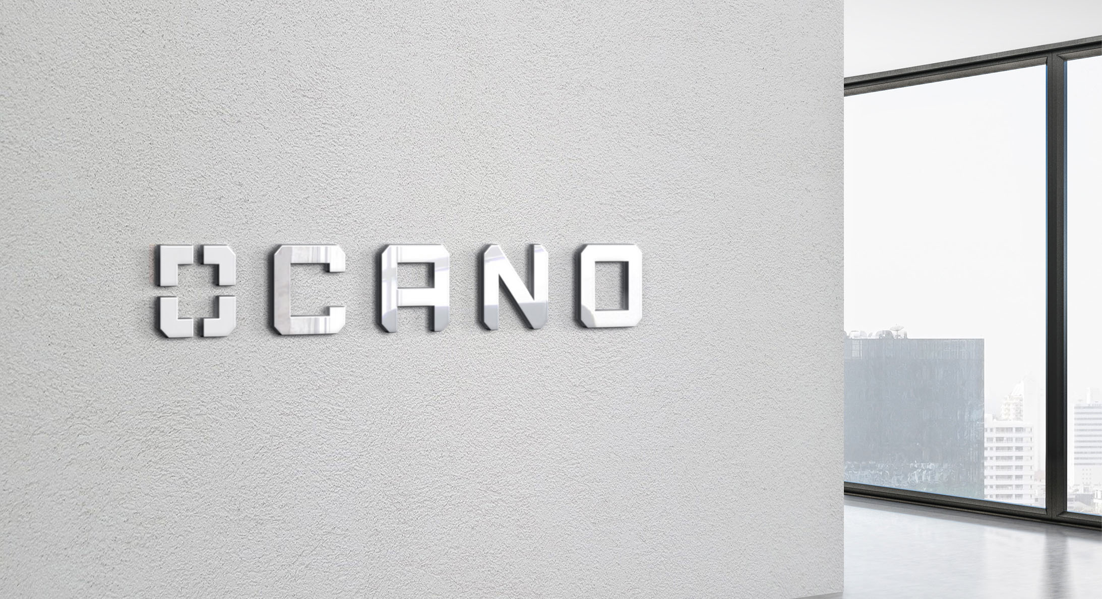
The client’s preference for this project was to have a typographic logo that focuses on a business name and that altogether represents company core values: experience, agile, trust, innovation…
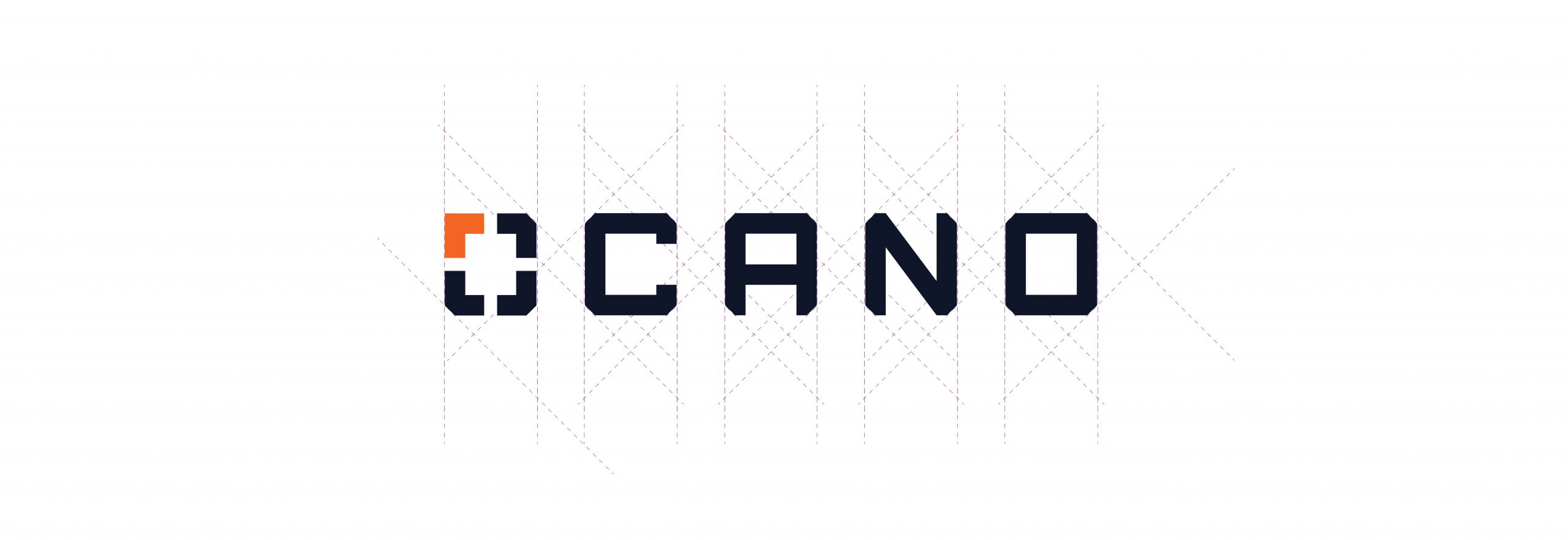
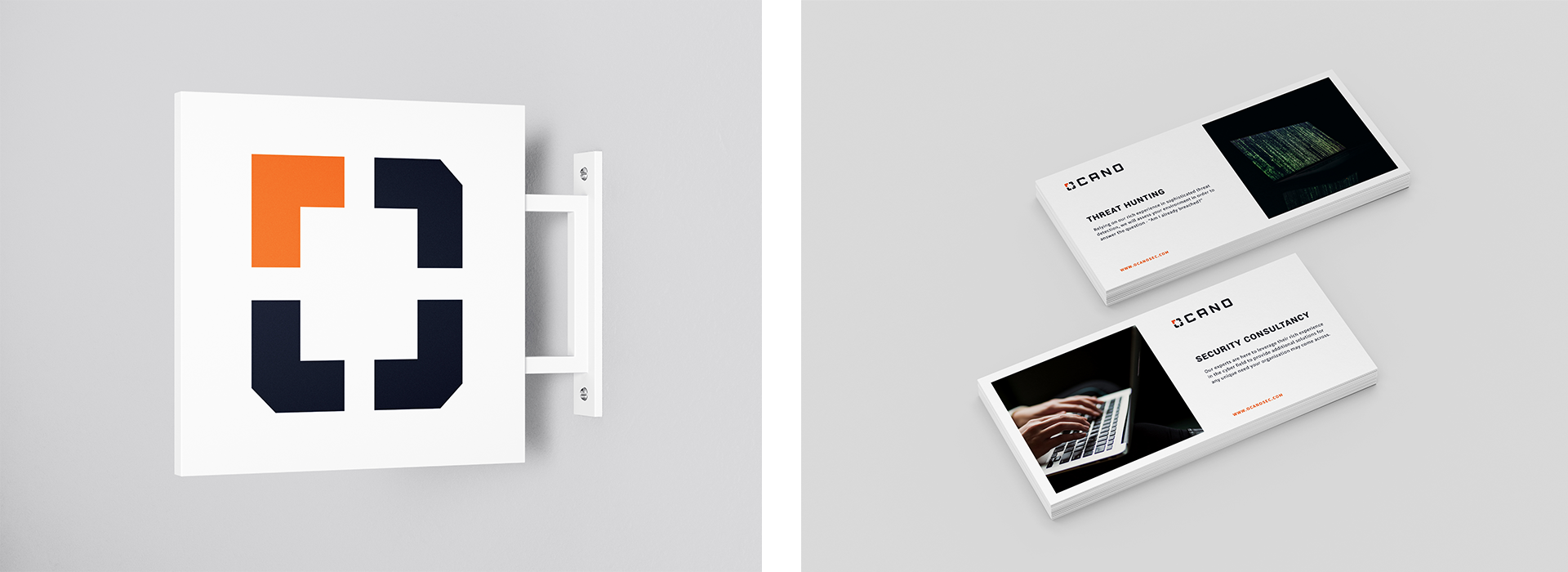
Idea was to create each of the letters ‘OCANO’ as a unique set of shapes that have a base from the first letter/symbol O. These created letters work perfectly together and they have a consistent look. The symbol represents the cybersecurity process – Scan/Identify/Repair. It was important that the logo feels high-end, professional, innovative and unique.
One of the challenges on this project was to make sure Ocano stand out from the competition and avoid cliche choices for a cybersecurity company such as shield, eagle,owl, lock, trojan horse, etc.
